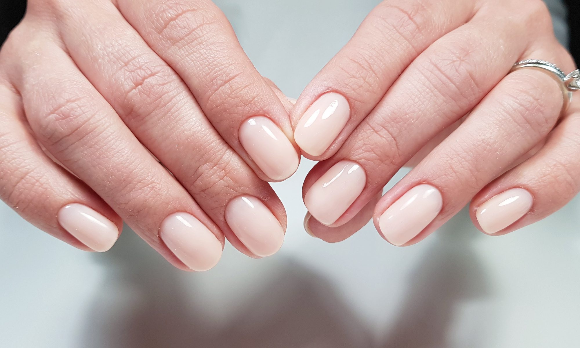

Top 17 colors from New York and London Fashion Week.
The Pantone color analysis gives us the anticipated spring 2018 color trends, and they are just as appealing as anyone could anticipate. The Pantone spring 2018 color trends feature light and soft colors, as well as deeply rich shades that will work beautifully well in most closets and for most aesthetics.

Both New York and London Fashion Weeks have shared key colors like Meadowlark and Lime Punch. The upcoming options are sure to leave a lasting impression from the catwalk to the closets and nail polishes.
#1. Pantone 13-0646 Meadowlark
Meadowlark is a bright and interestingly bold shade of yellow. The color is reminiscent of the breast of certain species of meadowlark, and looks amazing in both the New York and London Fashion Week lineups. This is a standout spring 2018 color that will easily transition from spring to summer.

#2. Pantone 17-1563 Cherry Tomato
Cherry Tomato is another bright shade that shows up in both New York and London. The blustery and well-blended color has hints of orange and red that give it an upbeat, full-bodied bright rather than deeply rich red.

#3. Pantone 16-4132 Little Boy Blue
Little Boy Blue is a soft, clean blue color reminiscent of a light touch and a clear day. This Pantone spring 2018 color suggests a breeziness that feels like spring as the color is observed, absorbing into the imagination. Little Boy Blue is certain to complement all skin tones beautifully.

#4. Pantone 18-1440 Chili Oil
Chili Oil has the best of the browns mixed with the best of reds for a rich, earthy color for spring 2018 that feels robust yet subdued simultaneously. Predicted for the New York spring 2018 fashion shows, it will be a delight to see this color utilized creatively.

#5. Pantone 14-3207 Pink Lavender
Designed to be soft and romantic, Pink Lavender is the Pantone spring 2018 color that straddles the fence. This light yet lush shade shows up in both the New York and London Pantone spring 2018 color trend predictions. It’s a delicate, smooth color that creates a light spring aesthetic right away.

#6. Pantone 15-1520 Blooming Dahlia
Blooming Dahlia seems like a peachy, alluring update to the current nude trend. This color will seamlessly update the beckoning subtleness of the current shades of nude that have been running rampant through fashion and beauty options. The color is so right that Blooming Dahlia also shows up in both the New York and London spring 2018 color trend reports.

#7. Pantone 16-5533 Arcadia
Arcadia is a cool, clean greener take on teal. The color is earthy in a springtime way that emphasizes newness in an interesting and posh way. It is a lighter color but there is a depth thanks to the greener than blue combination that creates the Arcadia color for spring 2018.

#8. Pantone 18-3838 Ultra Violet
Ultra Violet is a distinguishing shade chosen for the spring/ summer 2018 color trend reports for both New York and London. This entrancing shade of red has a feel that rides the line between modern and retro with just the right amount of brightness for spring.

#9. Pantone 18-1028 Emperador
Rich earth tones are typically reserved for fall, but the chocolatey svelteness of Emperador is undeniable. This is the richest among the Pantone spring 2018 color trend choices, but an invaluable addition of strength and contrast that will work beautifully well with all the other colors for spring 2018.

#10. Pantone 12-2103 Almost Mauve
Perhaps the most reminiscent of past fashion adventures, Almost Mauve is another shade included in the Pantone color trend choices for spring 2018 for both New York and London. The color is just soft enough to still provide a crisp look but not so sharp as to be peculiar. The shade is brilliantly feathery soft in appearance and will complement a full variety of spring 2018 colors as well.

#11. Pantone 17-3020 Spring Crocus
Spring Crocus is a bright and tenacious light shade of purple that is equal parts bright and smooth. Since there is another shade of purple in the chosen spring 2018 color trends, it would mean they both have to stand out. Spring Crocus is a completely unexpected shade that will have a lot of incredible application in the upcoming spring styles.

#12. Pantone 13-0550 Lime Punch
Described as both “sharp and pungent” by Pantone, Lime Punch shows up in both New York and London color trend projections. The color is clearly a vibrant shade of green with a good amount of yellow mixed in, but the inclusion of the yellow creates a more vigorous effect to the color.

#13. Pantone 18-4043 Palace Blue
Palace Blue is a color that can be accurately described as dreamy and even optimistic. This spring 2018 color is light, brightening up the range of blues that people are used to. Though not an expected shade for spring, Palace Blue makes a lot of sense with the concept of bright and cheery looking, perfectly acclimating into the palette.

#14. Pantone 17-1514 Ash Rose
Ash Rose is a dashing color full of earthy sophistication. The color, though not bright or overwhelming, is a stunningly natural looking, comforting shade of rose. This is a color that will likely be mirrored throughout accessories and products as well for a soft and sweet look.

#15. Pantone 14-0121 Nile Green
Nile Green is the soft color imagined that is apparent without superseding the other range of brightly or richly colored greens. Nile Green is light and wispy for a perfect spring feel that will evoke calm and current style.

#16. Pantone 18-1325 Spiced Apple
Spiced Apple is as rich and red as any fall color, but designed to be brilliantly strong during spring. The perfect mix of reds and browns creates the incredible color for spring 2018 that will stand out amongst any designs in any spring collection in just the right way.

#17. Pantone 17-1929 Rapture Rose
Rapture Rose is meant to be a romantic shade of rose that artfully blends charming allure and a coquettish soft color. The blend effortlessly evokes these concepts and will no doubt be used in other-worldly designs perfect for the color.
